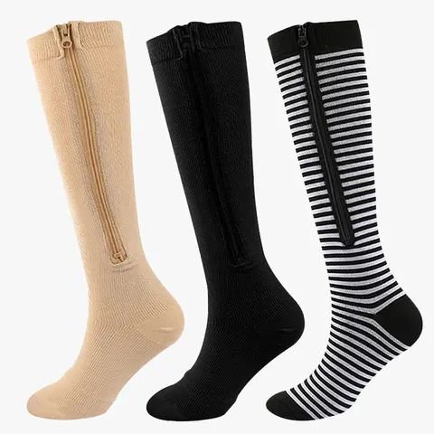
Quick answer: What makes a sock look clinical is beige or opaque skin tones, a shiny finish and a plain wide cuff. Patterned, matt and darker designs read as ordinary socks, and nobody looking at your ankles can tell how a sock is knitted.
I spent years fitting hosiery, and the single most common reason people gave for not wearing something that would have suited them was that they did not want to look like they were wearing it.
What actually gives a sock away
Four things, and none of them is the compression itself.
Beige and skin-tone colours. The strongest signal by a distance. Nobody chooses beige socks for fun, so a beige sock reads as functional.
A sheen. Older support hosiery often had a slight shine, and that is what people picture.
A plain, wide, undecorated cuff sitting high on the calf with nothing else going on.
Very sheer, tight-knit fabric, which reads as hosiery rather than as a sock.
Avoid those four and nobody can tell.
What does not give it away
The knit itself. A graduated sock and an ordinary sock look identical from the outside - the difference is in the tension, which is invisible.
The length. Plenty of people wear knee-high socks for no reason at all.
The fit. A well-fitting compression sock looks like a well-fitting sock.
Patterns are the easiest fix
A pattern removes the whole question, because patterned socks are obviously chosen rather than prescribed.
The patterned four-pack, Midnight Patterns and Big Hearts all read as ordinary socks - the women's range and the men's range have more.
Or go properly plain
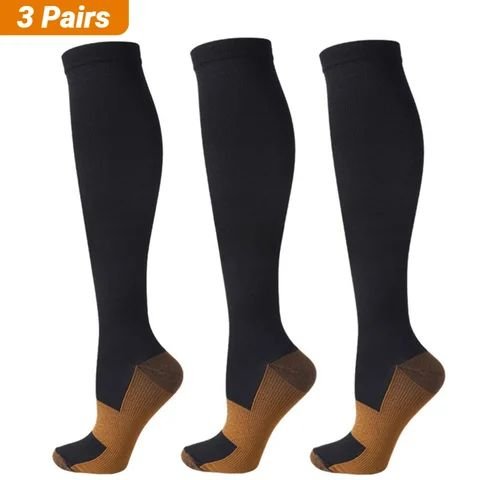
The other direction works equally well. A plain black or charcoal sock in a matt finish is invisible under trousers and unremarkable with anything else.
The trick is that it must be a real colour rather than a neutral - black, navy, charcoal, a proper grey - rather than beige or a skin tone - Plain and Simple is the straightforward version.
Colour, if you want it
Nothing announces "ordinary sock" like a colour somebody clearly picked because they liked it.
Jazz Night, Sunset Fade and the colour mix three-pack are all firmly in that territory.
The cuff is what people notice
If anything gives a sock away at a glance, it is the top.
A wide, plain, tightly-gripping band sitting high on a bare calf is the visual most people associate with support hosiery. A cuff that sits flat, in the same colour and pattern as the rest of the sock, reads as an ordinary sock top.
It is also a fit question - a band that is digging in is visible through a trouser leg, which draws far more attention than the sock itself ever would - the sizing guide covers getting that right.
Sheer versus opaque
A useful distinction. Sheer fabric reads as hosiery, and hosiery reads as clinical to a lot of people.
An opaque knit in an ordinary sock weight does not - it simply looks like a sock, because that is what it looks like. If the concern is appearance, opaque is the safer choice in every colour - the women's range and the men's range are mostly opaque knits.
Where people worry about it most
At work, especially somewhere with a uniform, where the concern is usually about looking unwell rather than about the policy - the work socks guide covers what passes.
On a plane, where people take their shoes off and feel visible.
In the gym, where sports patterns look entirely at home - the sport range covers those.
Socially, particularly for younger wearers who dislike the association.
With different shoes
A practical note. Knee-highs disappear entirely under trousers. With a skirt or dress they read as knee-high socks, which is a normal thing to wear. With trainers and shorts, a sports-looking pattern is the natural choice.
The combination that draws attention is a beige knee-high with a skirt, which is exactly the picture people have in their heads and exactly what none of the above looks like.
If you genuinely want them invisible
Two options. A low-cut or ankle style disappears in trainers, though it covers none of the calf - the ankle range covers those.
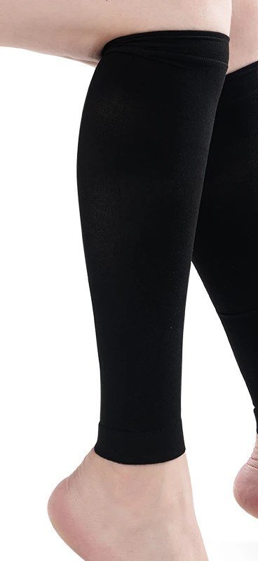
Or a footless calf sleeve worn under trousers, which shows nothing at all at the ankle - the footless range covers those.
Why this matters more than it sounds
Because a sock you feel self-conscious in is a sock you do not wear, and an unworn pair helps nobody.
Of all the reasons people give up on compression socks, disliking how they look is the easiest one to solve - it costs nothing to buy a design you would have picked anyway - the everyday range is built around that idea.
The three-second mirror check
If you are worried before going out, this settles it faster than reading any more advice.
Stand in front of a mirror in the shoes and the trousers or skirt you are actually wearing. Then do three things.
Sit down. This is the one that matters, because sitting is when a trouser leg rides up and the cuff appears. If the band is plain and dark, nothing happens. If there is a pale ribbed line, you will see it immediately.
Cross your legs. It pulls the sock top higher than sitting does and shows you the most exposed version.
Walk a few steps and look at the ankle. With shorter lengths this is where a sock can bunch and draw the eye.
If all three pass, you are fine for the day and you can stop thinking about it.
In my experience people fail this check on the cuff and nothing else. Swap to a plain dark band or a patterned pair and the whole worry disappears.
Worth doing once, with each pair, rather than wondering every morning.
And if a pair fails the check, it is not wasted. Keep it for days at home, under boots, or for travelling, where none of this matters.
Every drawer ends up with a pair like that. It is not a mistake, it is just a pair with a narrower job than you planned.
This is comfort advice, not medical advice. The everyday comfort guide covers the wider subject.
The short version
- Beige, sheen, a plain wide cuff and very sheer fabric are what read as clinical.
- The knit itself is invisible - a graduated sock looks like any other sock.
- A pattern removes the question entirely, because patterns are obviously chosen.
- Plain works too, as long as it is a real colour rather than a skin tone.
- Disliking how they look is the easiest reason for giving up to solve, and it is free.
Frequently asked questions
What makes compression socks look clinical?
Four things: beige or skin-tone colours, a slight sheen, a plain wide undecorated cuff, and very sheer tight-knit fabric that reads as hosiery. Avoid those and nobody can tell what you are wearing.
Can people tell by looking?
Not from the knit. A graduated sock and an ordinary sock look identical from outside, because the difference is in the tension, which is invisible. Length gives nothing away either - people wear knee-highs anyway.
What is the easiest way to avoid the look?
A pattern. Patterned socks are obviously chosen rather than prescribed, so the question does not arise. Going properly plain in black or charcoal works equally well, as long as it is not a beige or skin tone.
What if I want them completely invisible?
A low-cut or ankle style disappears in trainers, though it covers none of the calf. Or a footless calf sleeve worn under trousers, which shows nothing at all at the ankle.
Does it really matter how they look?
Yes, because a sock you feel self-conscious in is a sock you do not wear. Of all the reasons people abandon compression socks, disliking the look is the easiest and cheapest one to solve.